YELLOW
Yellow Pay Inc. was seeking to process payments for vendors and customers in The Middle East and North Africa. MENA was underserved and overcharged by the banking apparatus and Yellow offered a cheaper and easier alternative using Bitcoin.
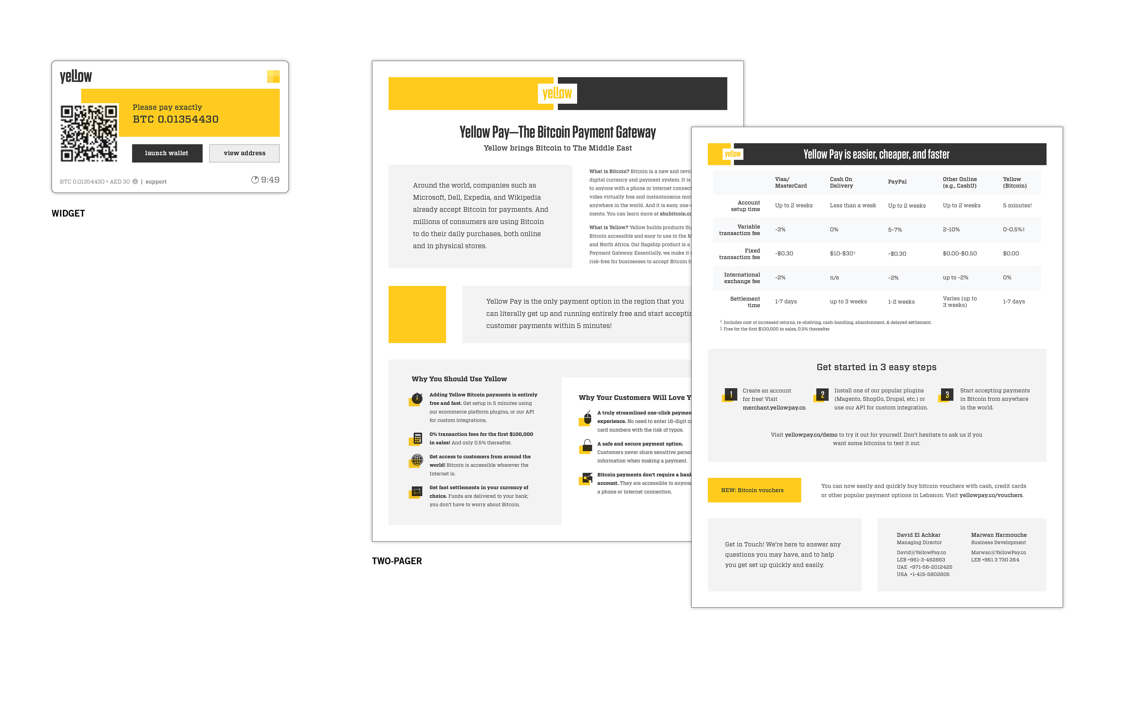
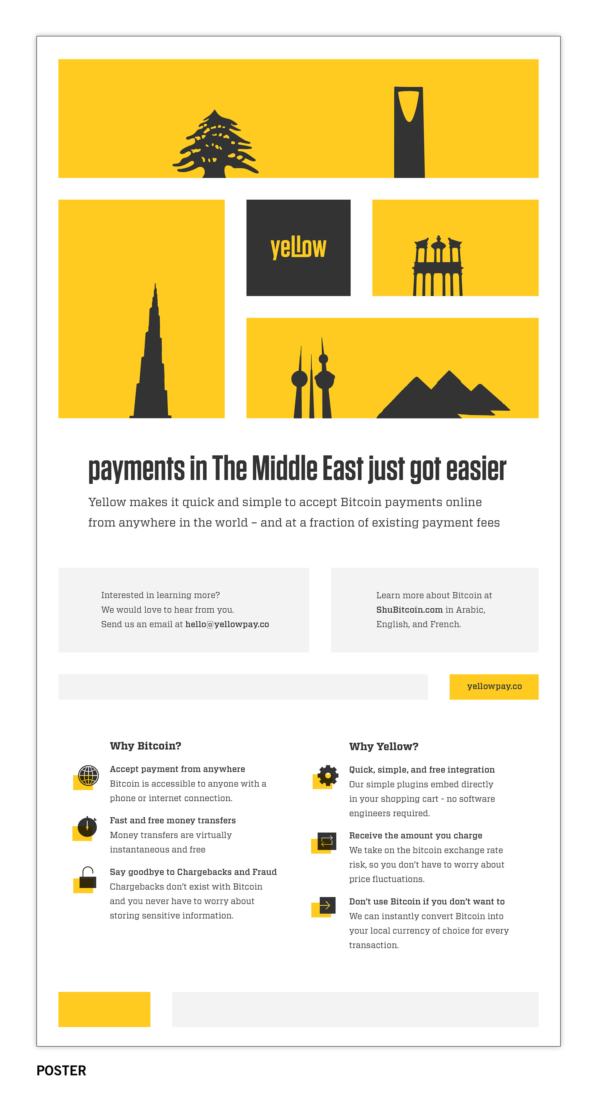
The payment processing startup, Yellow, needed to be memorable and to convey security. Yellow was committed to creating a financial infrastructure where faulty and incomplete versions had existed. Therefore its region, the Middle East and North Africa, was emphasized in the branding and designs. The design system uses layouts to express the concepts of security and infrastructure. Elements are separated and connected through a strong, rigid grid. The building blocks of the content are brought together through a tight, rational protocol.
BRAND SYSTEM—COMPONENTS AND RULES
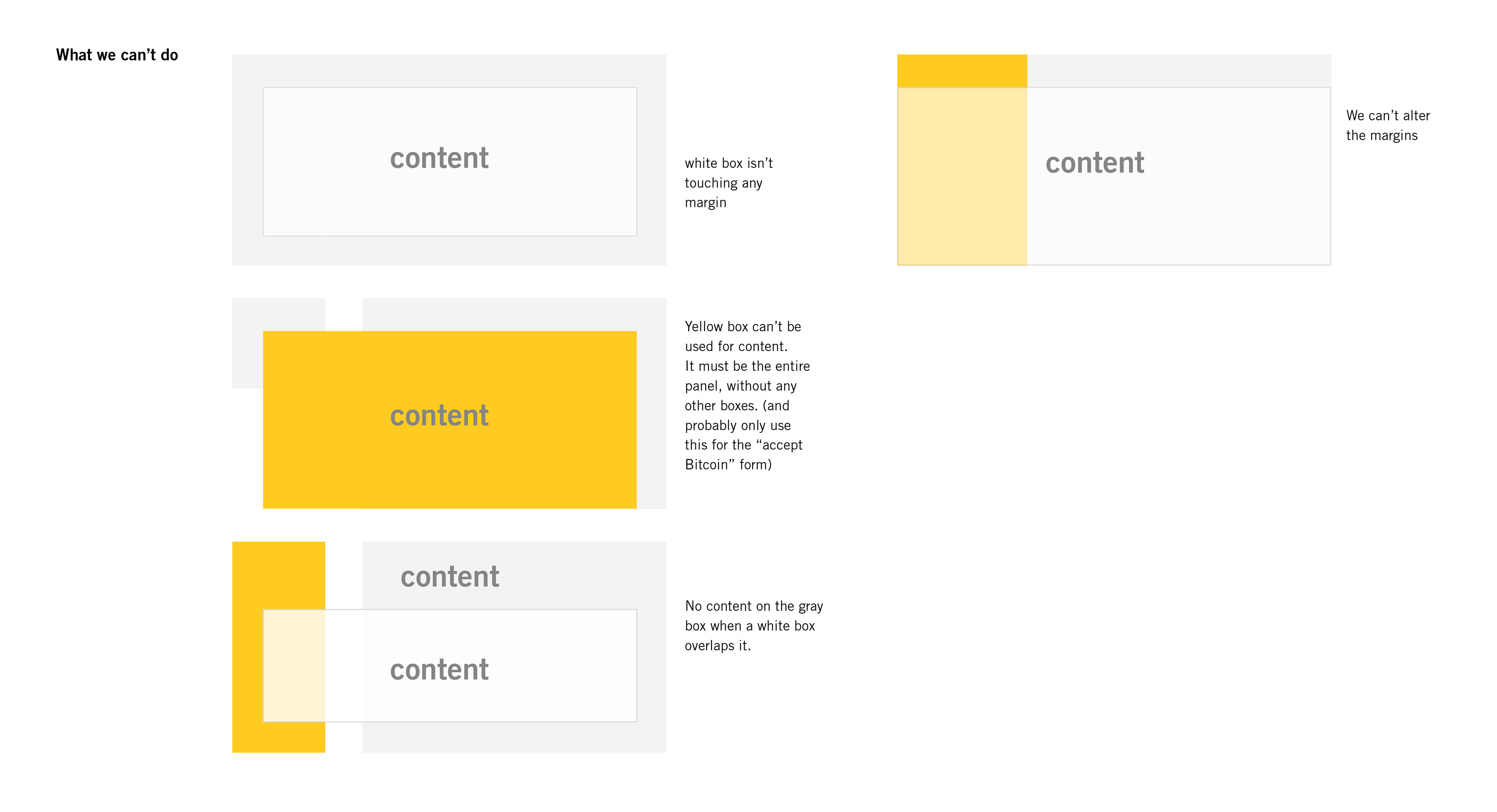
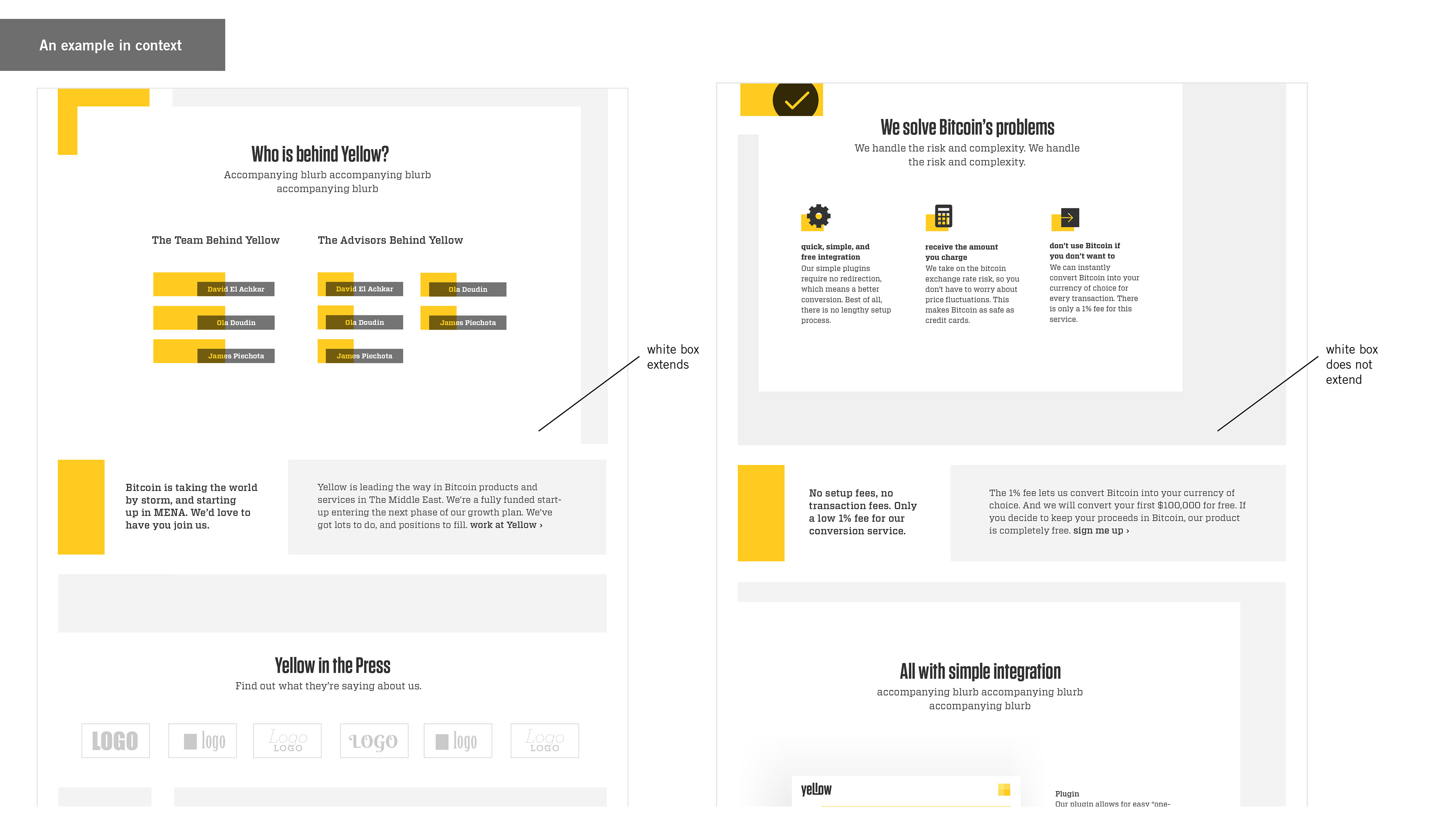
1. The yellow and gray boxes must have the set margins around them, and must be aligned with each other.
2. Only an icon can be placed on the yellow box.
3. Content can only go on the gray box if the white box does not overlap with it.
4. Their sizes can change, you don’t have to use both.
5. The white box can be placed anywhere on top of these background boxes.
6. However the white box must be connected to a margin.
Compare to different brand aesthetics
PORTFOLIO
